Business Branding: What colours should I use?
- Mar 15, 2021
- 3 min read
Color is a massive aspect of your branding. You don't just pick your favourite colours and fonts here! You see, there is a lot behind color psychology and the feelings they inspire...
How does this yellow make you feel?

Happy Maybe?
That's because colours can alter your emotions and even influence your shopping habits? As many as 85% of us believe that colour is the primary factor when buying a product and 90 seconds is all it takes for a product to create an impression on us and others. The colours of your logo, your website, social media, your products and marketing are therefore critical to portray the right values and encourage more sales. When companies have experimented with their button colours, for example, they noticed a sharp incline or decline in their conversions. For example, Beamax, a company who makes projection screens, noticed a massive 53.1% increase in clicks on links that were red vs links that were blue. That's a huge difference! This is probably due to the fact that red can trigger excitement and optimism.
For example, bright colours trigger neurological responses in the brain and cause the hypothalamus gland to release hormones associated with happiness. Visually seeing bright colours such as pink, red, orange and yellow help with the release of dopamine, making us feel happier.

Yellow
Yellow tends to make people think of summer, sunshine and flowers and yellow is connected to increased mood and mental activity as it increases the production of serotonin in the brain, speeds up metabolism and lifts the mood to all those around it. Fancy a summer holiday?


Orange
Similarly, splashes of orange lift the mood and low energy levels and have been shown to have an influence on your focus and concentration too. Orange always gives an atmosphere a fun party vibe, in addition to being a warm and opportunistic colour. It is also cheerful, creative and attractive. Many websites for children will have bright colours and orange on it to portray the fun vibe.


Blues
Blues and greens can be soothing and calming. Blue is very often used by companies who need to portray a trustworthy and respectable image. Think banks, finance, hospitals, NHS, airlines and so on. Blue helps to show they're professional and can be trusted. Think of us here at Moon Digital, we use blues to show you can trust us with your designs but also elements of orange to demonstrate our ability to create fun and engaging websites and graphics too!


Black
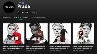
Black is a colour that is taken seriously. It also shows luxury and elegance. For example, it's often seen used by Chanel, Sony and Prada but also in more serious businesses such as funeral directors.


Other Colours:
Green: Gives a fresh feeling of calm and nature that is gentle and non-offensive (Nature Valley, Body Shop)

Red: Can trigger excitement and optimism - often used in fast food brands and sales to give you a quicker heart beat and feel a sense of the need to rush (Mcdonalds, KFC, Nintendo)
Brown: It's the colour of earth and shows solid and simple foundations to portray an image of reliability and versatility. (Nespresso/Coffee, Agriculture, Legal)
So, when selecting a colour scheme you first want to get a good understanding of what you’re selling and providing and who the audience are. For example, if you’re trying to achieve a more premium, high-end image, then purple is your go-to, as people associate it with royalty, high quality, and intrigue.
Seeing how important colors are to your brand, you might be spurred into wanting to rebrand your website, logo and social media or get a new business website. Either way, we're here to help you decide on what colors to implement into your website and help you get started.
Contact us at Moon Digital to see our range of brandings services for startups.


Comments